
Teaddy
This project is a branded advertisement campaign that focuses on creating a warm and inviting brand identity through a series of visually engaging posters and a custom logo for a tea shop called Teaddy. The campaign integrates the concept of a teddy bear with tea to convey a sense of comfort and charm. By combining playful design elements, the campaign aims to enhance brand recognition, attract customers, and establish Teaddy as an approachable and memorable brand.
Role
Graphic Design
Tools
Adobe Illustrator
Duration
Jan 2024 (1 month)
Mock-up

Creative Process
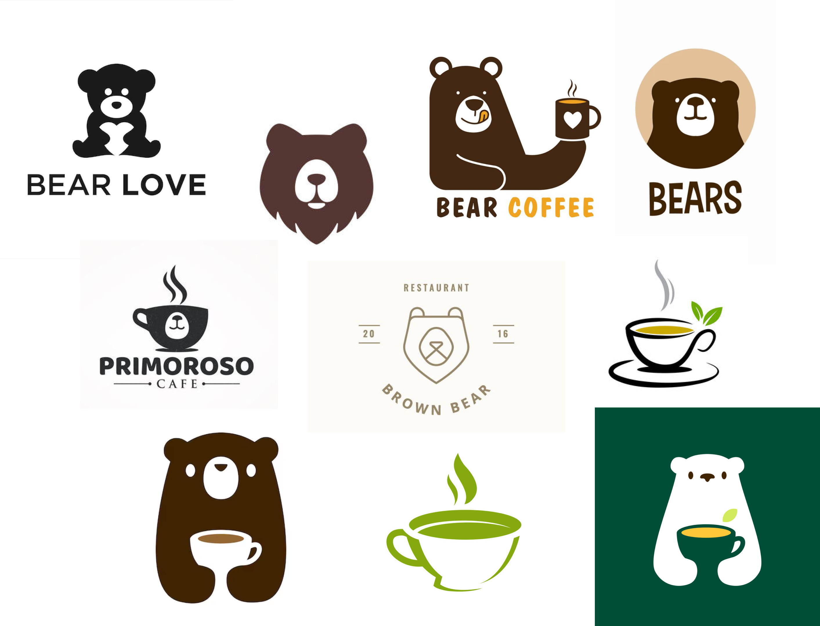
- Research and Inspiration:
- To craft a distinctive brand identity, I analyzed various bear-themed logos, focusing on how they conveyed warmth, friendliness, and approachability.
Logo Design: Drafted Logos
To integrate the bear theme with tea, multiple logo variations were created, experimenting with different bear graphics and compositions.
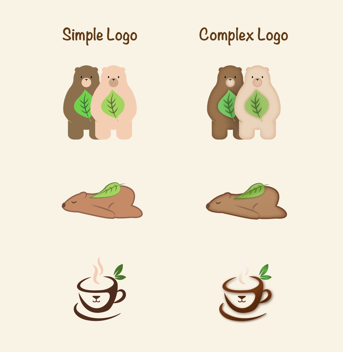
Two versions were developed:
- Simple Color Logo:
- A clean and modern representation.
- Detailed Color Logo:
- Featuring intricate details for a more dynamic look.
Logo Design: Final Logos
The logo with two bears, a white bear and a brown bear, embracing tea leaves are chosen as the final logo.
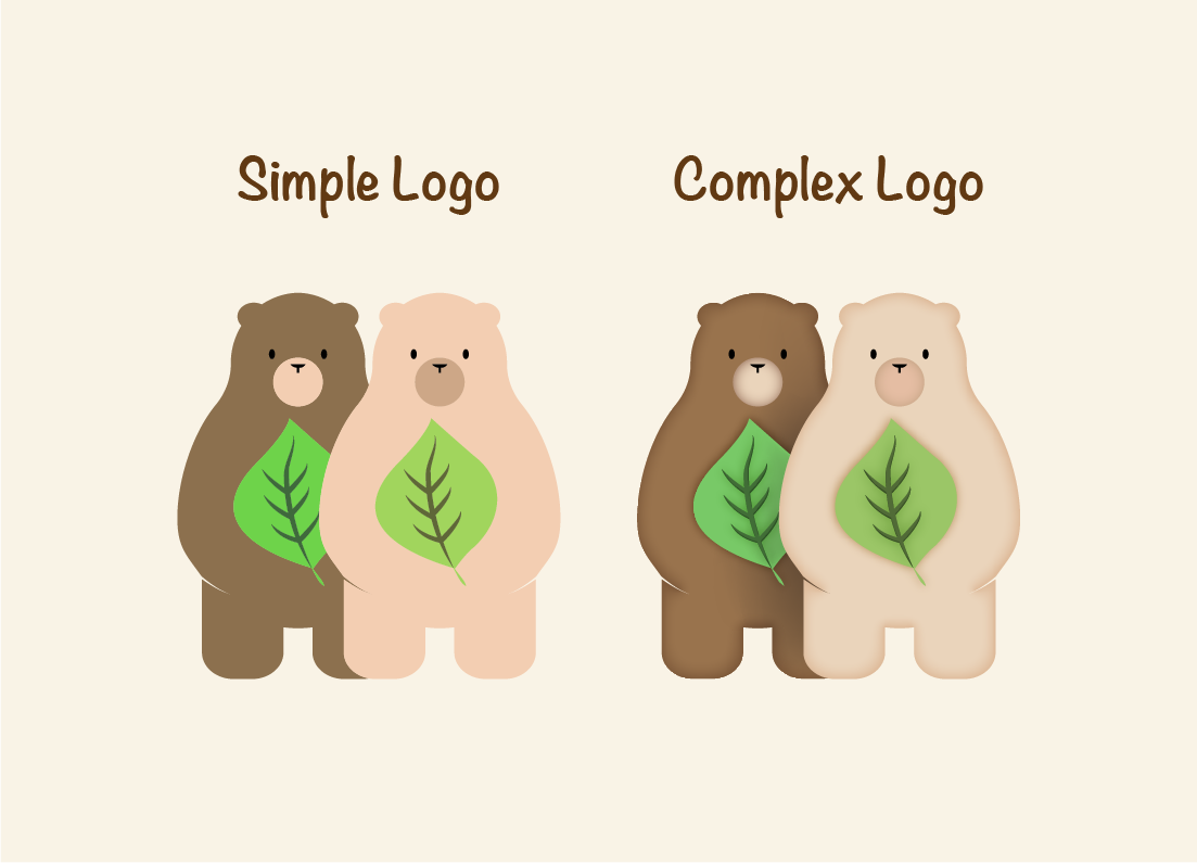
- Reason:
- The embrace of tea leaves of the logo symbolizes the shop’s dedication to high-quality tea.
- This gesture also represents the warmth and care the shop has for both its tea products and services, reinforcing its commitment to excellence.
Style Guide
The color palette is designed to reflect the essence of our brand, creating a warm, inviting, and playful atmosphere.
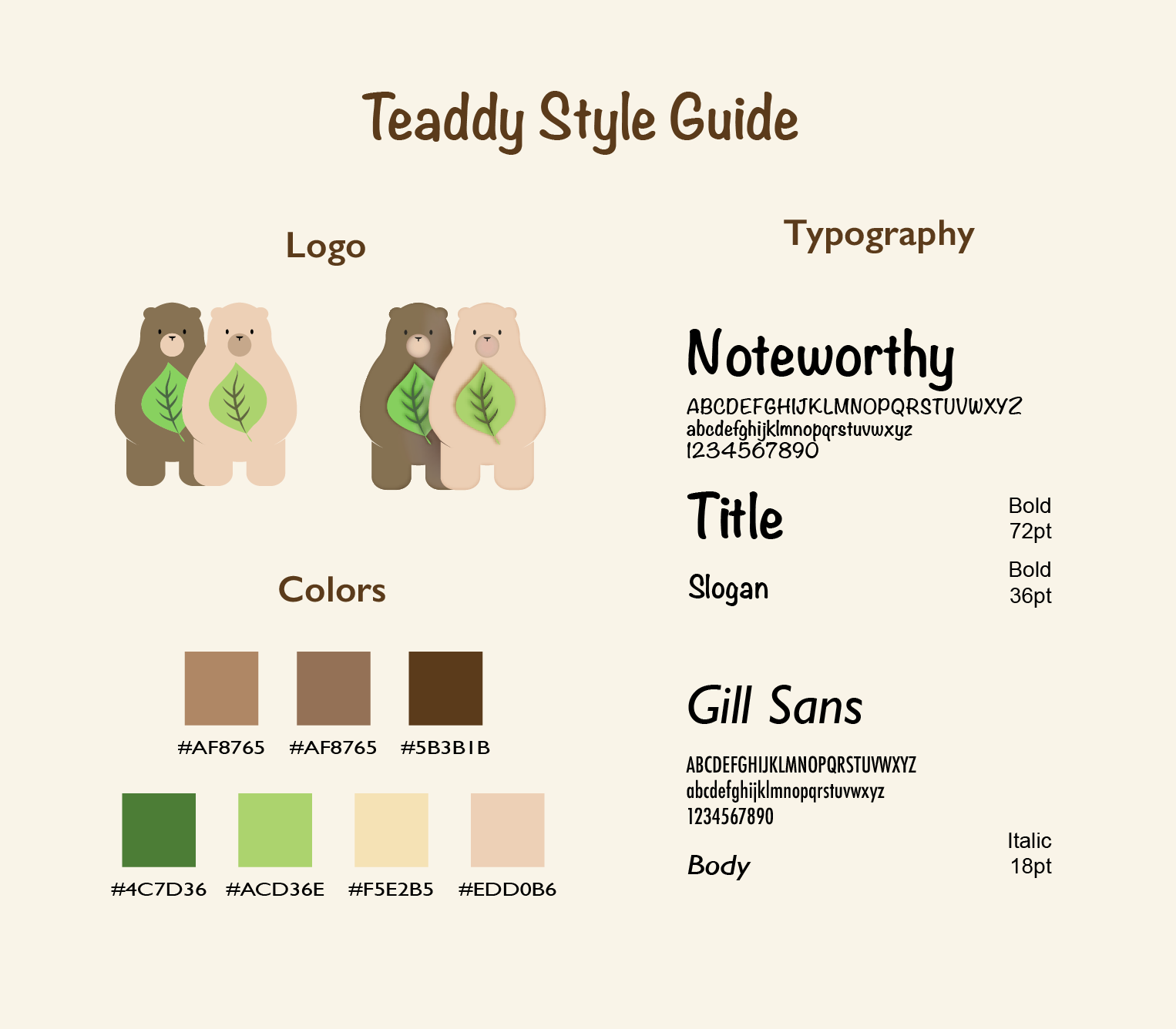
- Color Palette:
- Brown: Represents our mascot, a teddy bear, evoking comfort and warmth.
- Green: Symbolizes tea leaves, reinforcing the focus on high-quality tea products.
- Beige:A neutral complement that adds balance, warmth, and softness to the design.
- Typography:
- Noteworthy:Used for titles and slogans due to its rounded, handwritten form, adding a fun and friendly touch.
- Gill Sans: Used for body text because of its clean, modern sans-serif style, ensuring easy readability while maintaining a refined aesthetic.
Poster Design: Final Design
The final design incorporates key elements to ensure brand recognition and audience engagement:
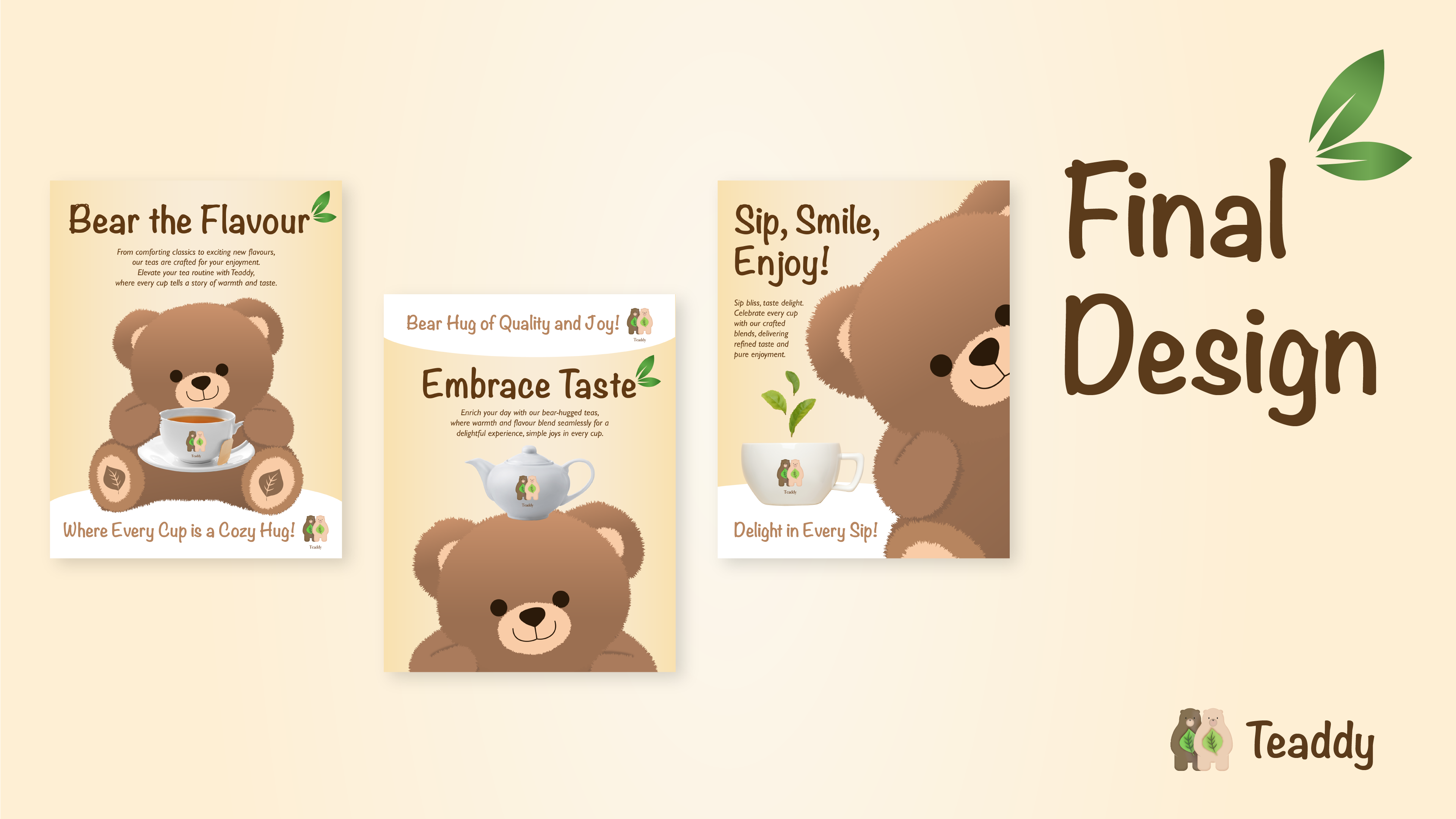
Key elements:
- Teddy Bear Mascot:
- TA central, eye-catching visual element that embodies the brand’s friendly and cozy essence.
- Product Showcasing:
- Teaddy’s signature tea products are featured with the branding logo, reinforcing brand identity.
- Slogans:
- Each poster contains a unique, playful tagline to keep the campaign fresh and engaging.
Reflection and Learnings
- Learned how to create a visual identity that aligns with a brand’s mission and personality.
- Discovered the impact of using mascots to evoke emotions and build brand recognition.
- Explored ways to blend a cute and friendly theme with a refined, modern aesthetic.