Remedify
Low adherence rate, misunderstanding instructions, and forgetfulness are common challenges in medication management. Remedify is an intuitive mobile app designed to revolutionize the way people manage their medications. By utilizing AI technology, Remedify provides personalized medication reminders, detailed drug information, and intuitive scheduling features, all within a simple, accessible interface.
Role
UX/UI Design, UX Research, Graphic Design, Usability Testing, Competitive Analysis, Frontend Development
Tools
Figma, Adobe Illustrator, Expo, React Native
Duration
Sep 2024 – Dec 2024 (3 months)
Problem
- Low Adherence Rate:
- Patients with chronic illnesses take only ~50% of prescribed medications.
- Misunderstanding Instructions:
- Over 60% of patients misunderstand medication directions after doctor visits.
- Forgetfulness:
- A major cause of non-adherence, affecting 49.6% of patients.
Solution
- Simplify Medication Regimens:
- Provides clear, organized schedules to prevent confusion.
- Explain Key Information:
- Displays essential details about each medication, including what the drug is and why is it prescribed.
- Smart Reminders:
- Sends timely alerts to help users take medications on time.
Features
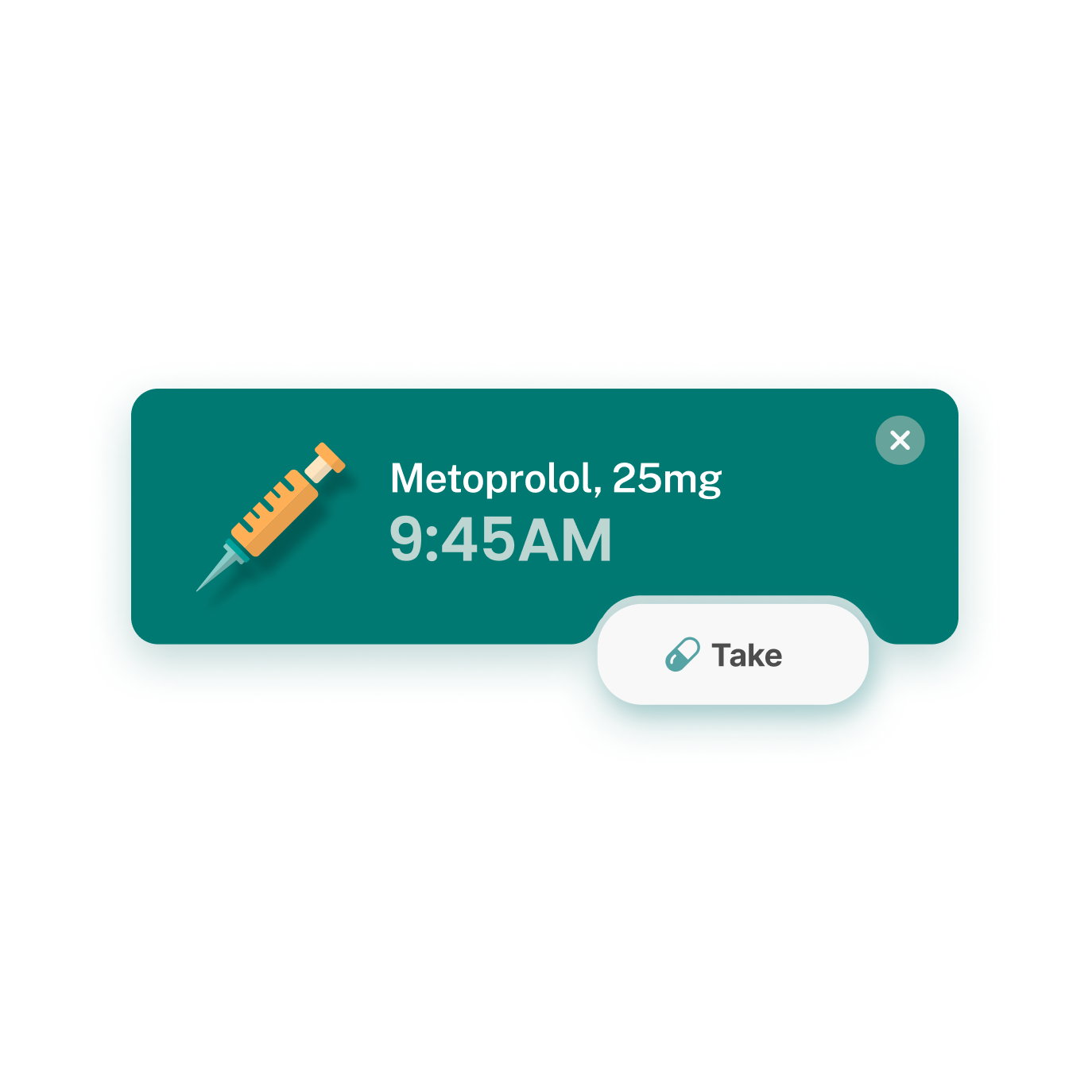
One-Tap Medication Logging
- Log each dose with just one tap
- Track medications effortlessly through a simple, intuitive interface
AI-Powered Label Scanning
- Easily scan medication labels to set up reminders automatically
- Minimize the steps needed to remember and simplify the process
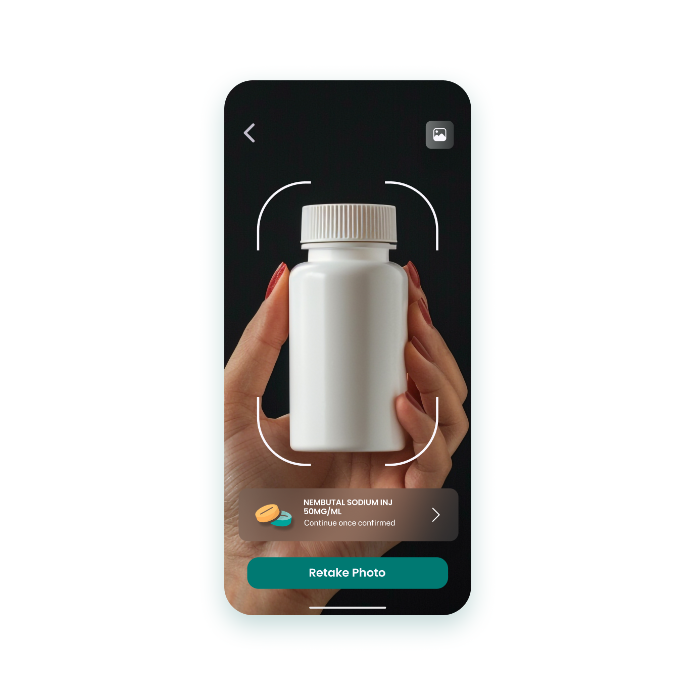

AI-Powered Label Scanning
- Easily scan medication labels to set up reminders automatically
- Minimize the steps needed to remember and simplify the process
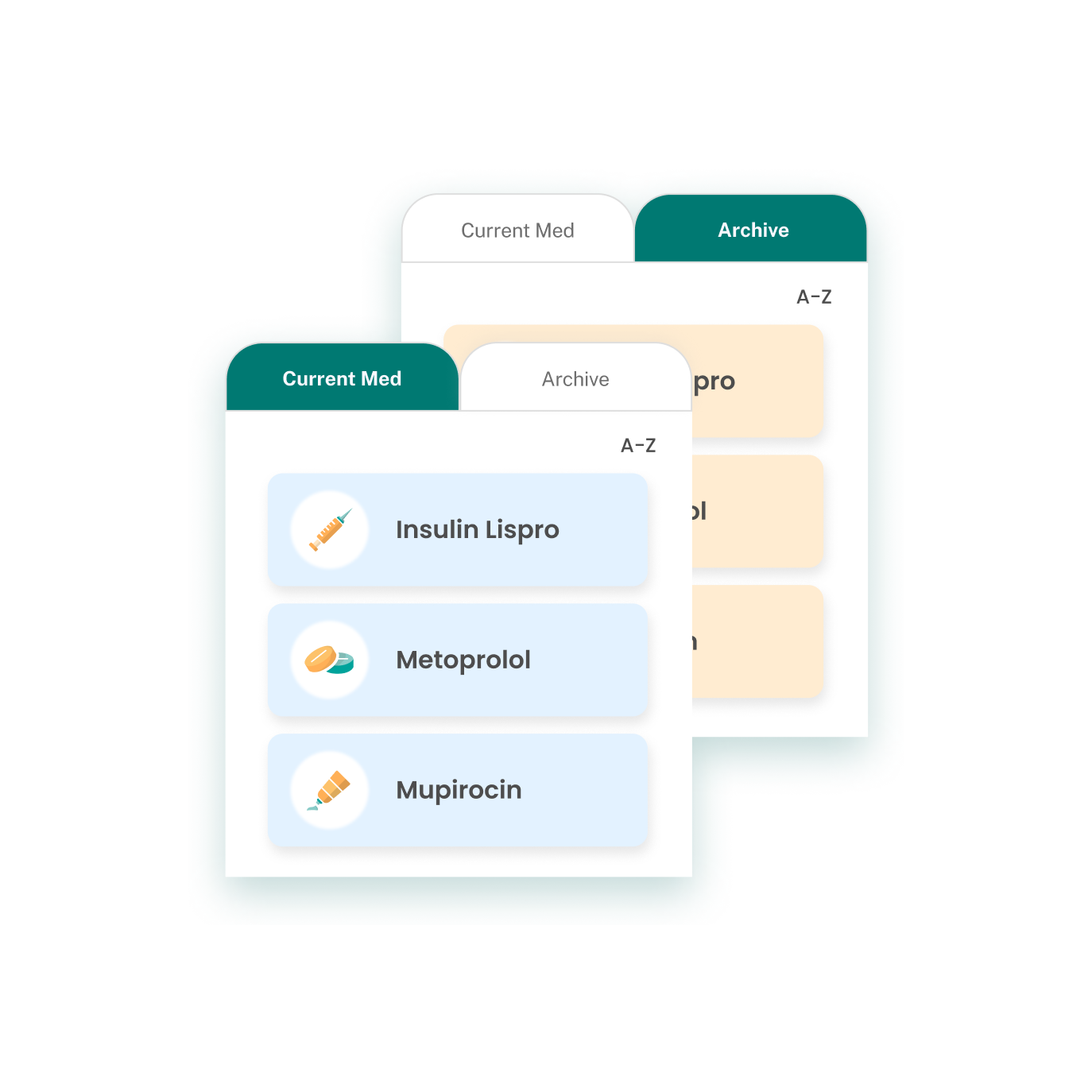
Accessible Medication Library
- Review all medications in one clear, accessible library
- Reliable and easy-to-understand information about medications to empower users
Dark Mode Support
- includes a dark mode to reduce eye strain and enhance accessibility, especially for users with visual sensitivities
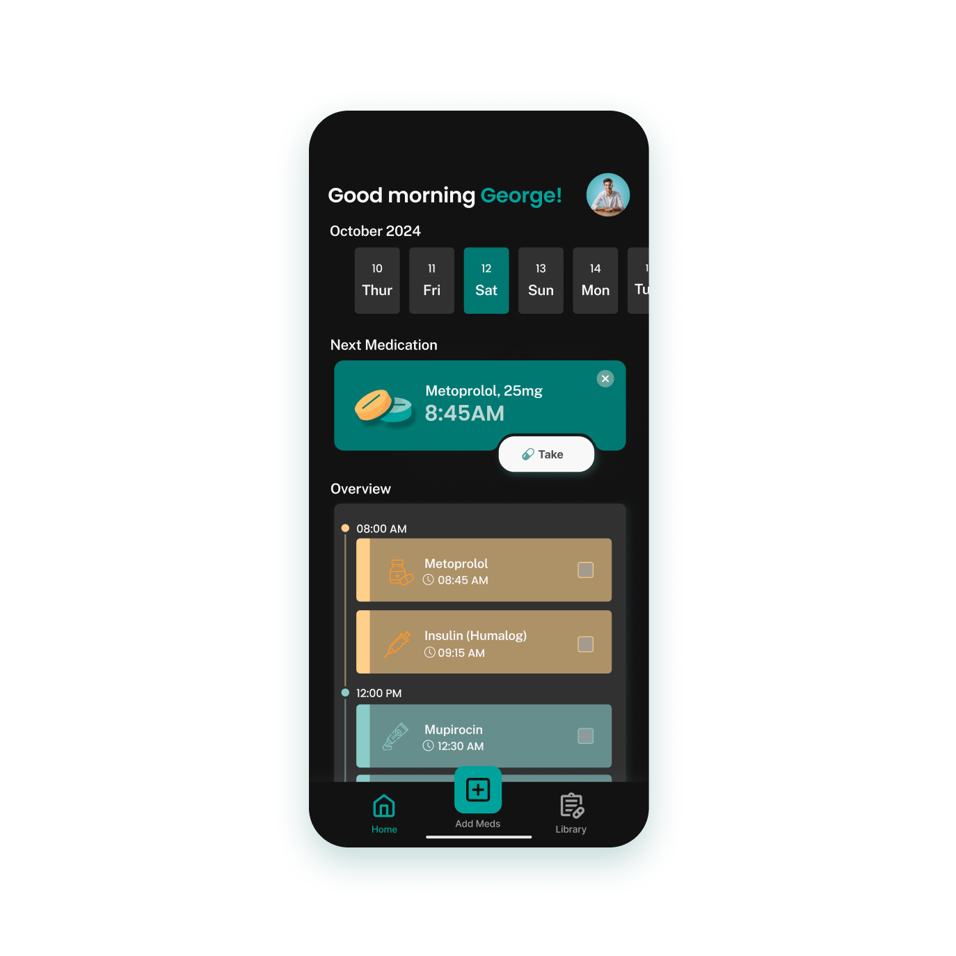

Dark Mode Support
- includes a dark mode to reduce eye strain and enhance accessibility, especially for users with visual sensitivities
User Research
Primary and secondary research were conducted to understand medication adherence and user needs. The primary research involved a survey distributed to 9 participants, along with interviews with self-administered patients, nurses, and caregivers to gather firsthand insights. For secondary research, existing studies, articles, and reports on medication routines were analyzed. Major findings are as follows:
- Tracking Medication Issues:
- Users often forget when or if they’ve taken their medication, highlighting the need for clear tracking and reminders.
- Understanding the Medication:
- Lack of knowledge about medications can lead to poor adherence, so educating users reduces fears and improves usage.
- Simplicity is Key:
- Existing apps often have a high learning curve, making them difficult to use.
Competitive Analysis
Analyzing the competition was a crucial step in understanding what is already available and identifying opportunities for improvement. By reviewing existing medication management apps, the team identified both their strengths and the gaps that needed to be addressed. This insight shaped Remedify into a smarter, more user-focused solution.
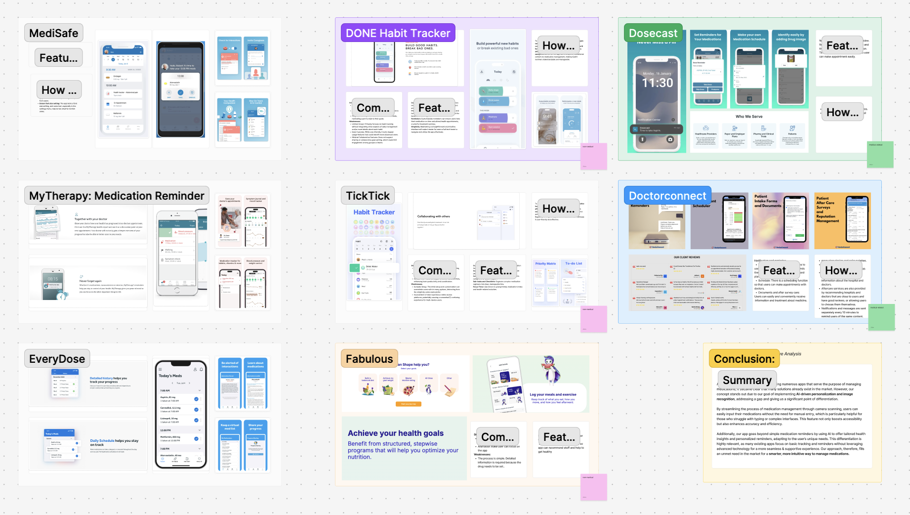
How Remedify Stands Out:
- AI-Driven Personalization:
- Remedify uses AI to provide tailored health insights and reminders that adapt to each user’s specific needs, creating a more supportive experience.
- Camera Scanning:
- Users can quickly scan their medication labels instead of relying on manual entry, making the process faster, easier, and more accessible.
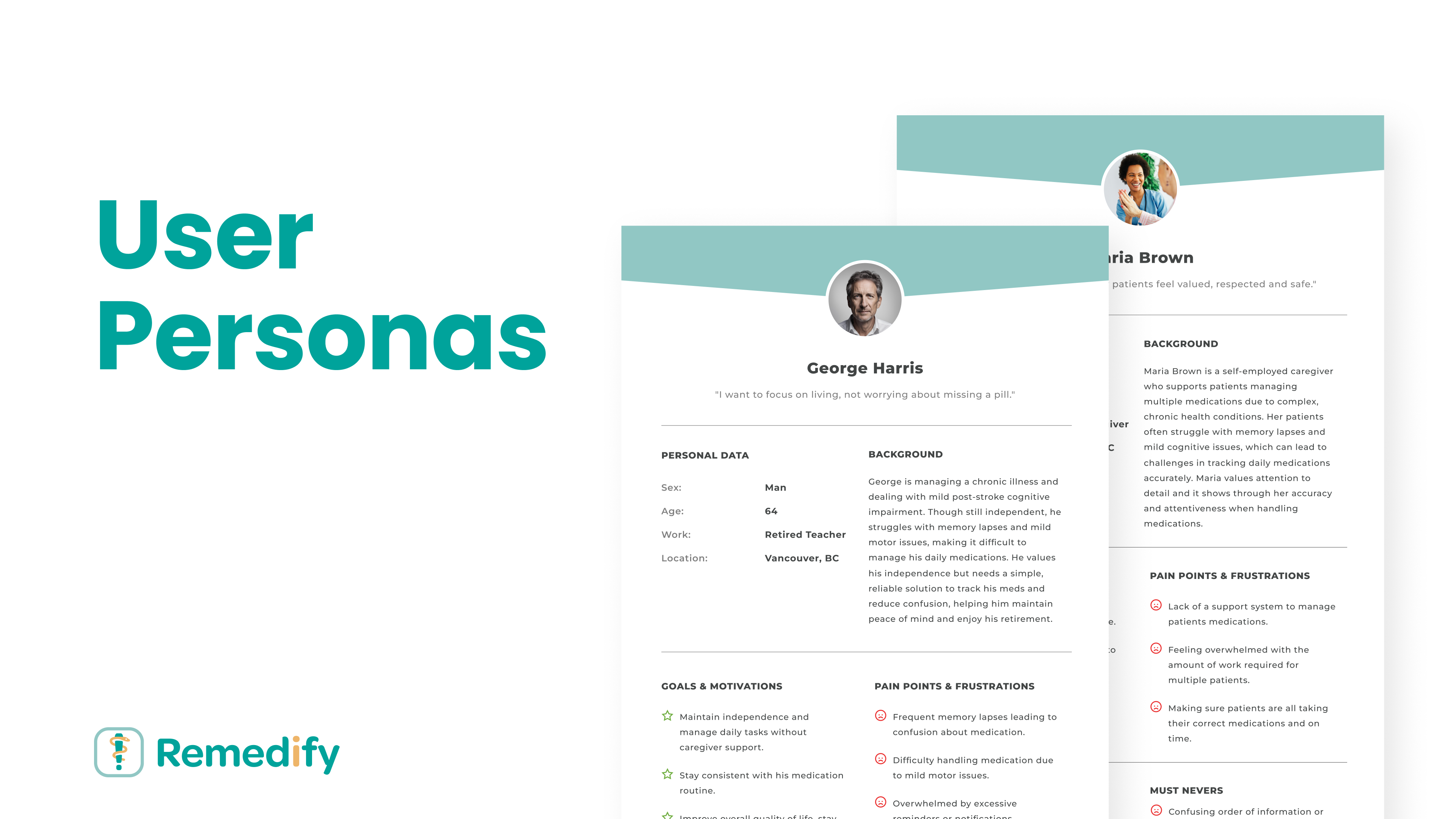
User Persona
User personas are developed to better understand and address the needs of the target audience. They guide thoughtful design decisions, ensuring the app remains practical, user-friendly, and relevant.
Style Guide
Remedify app's style guide is crafted to embody the app’s mission of supporting users in managing their health and medication. It is designed to provoke a calming, warm, inclusive, and accessible feeling.
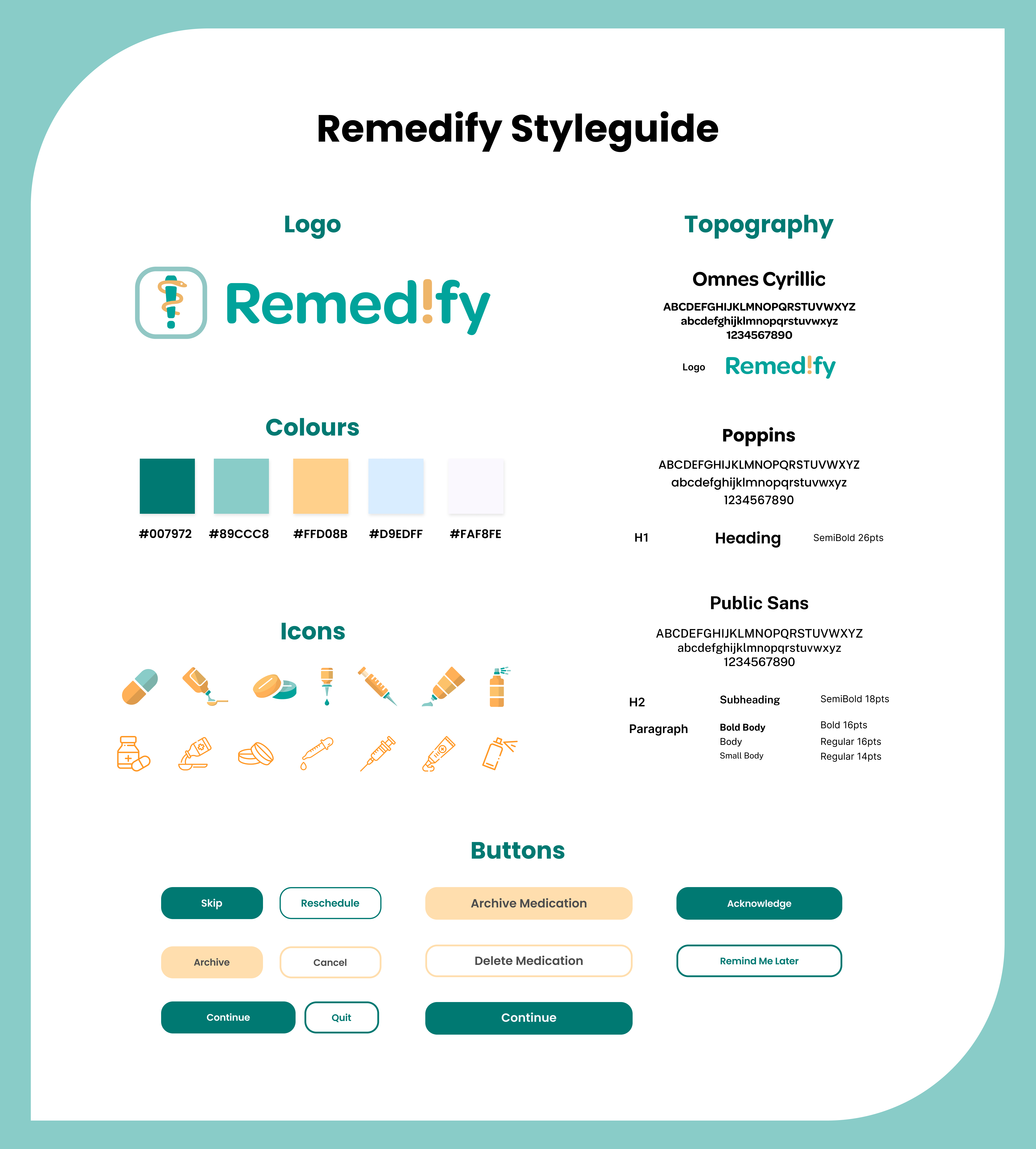
- Logo:
- The logo combines symbols that represent health and reminders.
- The Rod of Asclepius: A well-known medical symbol, highlights the app’s focus on healing and wellness.
- An exclamation mark: Emphasizes the app’s purpose of helping users stay on track with their medication.
- Colors:
- Green and Blue: Evoke a sense of calm and reassurance.
- Orange: Adds warmth, fostering a comforting experience for users, especially patients managing illnesses.
- Silver White: Conveys simplicity and cleanliness.
- Typography:
- Omnes Cyrillic: Used for the logo wordmark, chosen for its rounded and approachable style.
- Poppins: Applied throughout the app for headings and button text due to its friendly and easy-to-read appearance.
- Public Sans: Used as the body font to create a clear visual hierarchy and enhance readability.
Site Map
Based on user surveys, secondary research, and competitive analysis, a site map is developed for Remedify. It serves as a blueprint for the app’s structure, which helps organize features and ensure easy navigation.
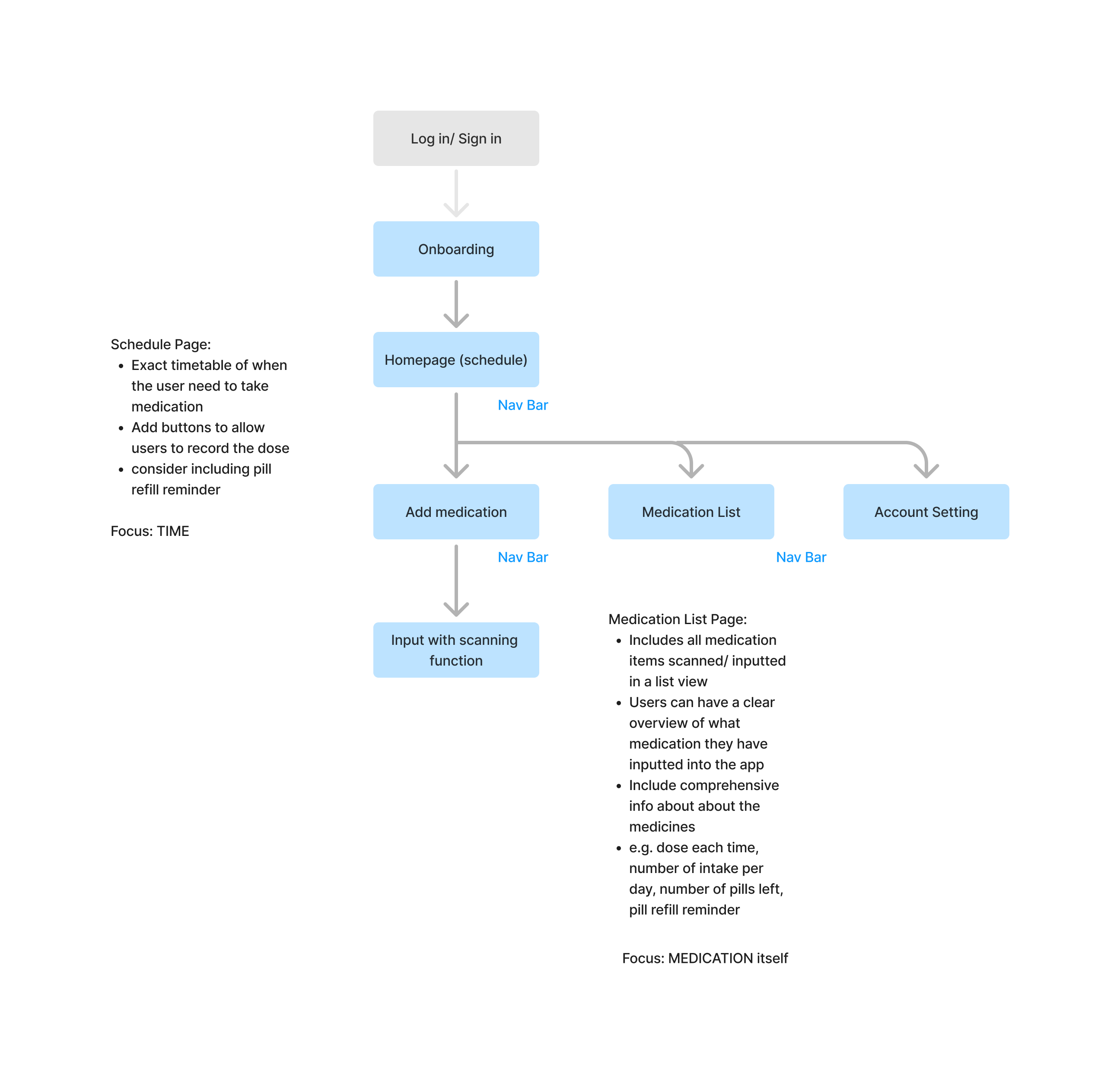
Major Screens in Remedify:
- Home:
- Users can see their medication schedule at a glance, with upcoming reminders and times clearly displayed.
- Add Medication:
- The app simplifies medication management by enabling users to scan labels with their camera or manually input details.
- Medication Library:
- Users can manage their medications and reminders in one place, giving them full control as needed.
- Account Settings:
- Users can add family members to help monitor their medications and adjust general app settings like font size and language preferences.
User Flow Map
The user flow map outlines how users interact with Remedify, ensuring a smooth and intuitive experience from start to finish. With accessibility as a core value, the flow simplifies complex tasks while maintaining clear and user-friendly navigation.
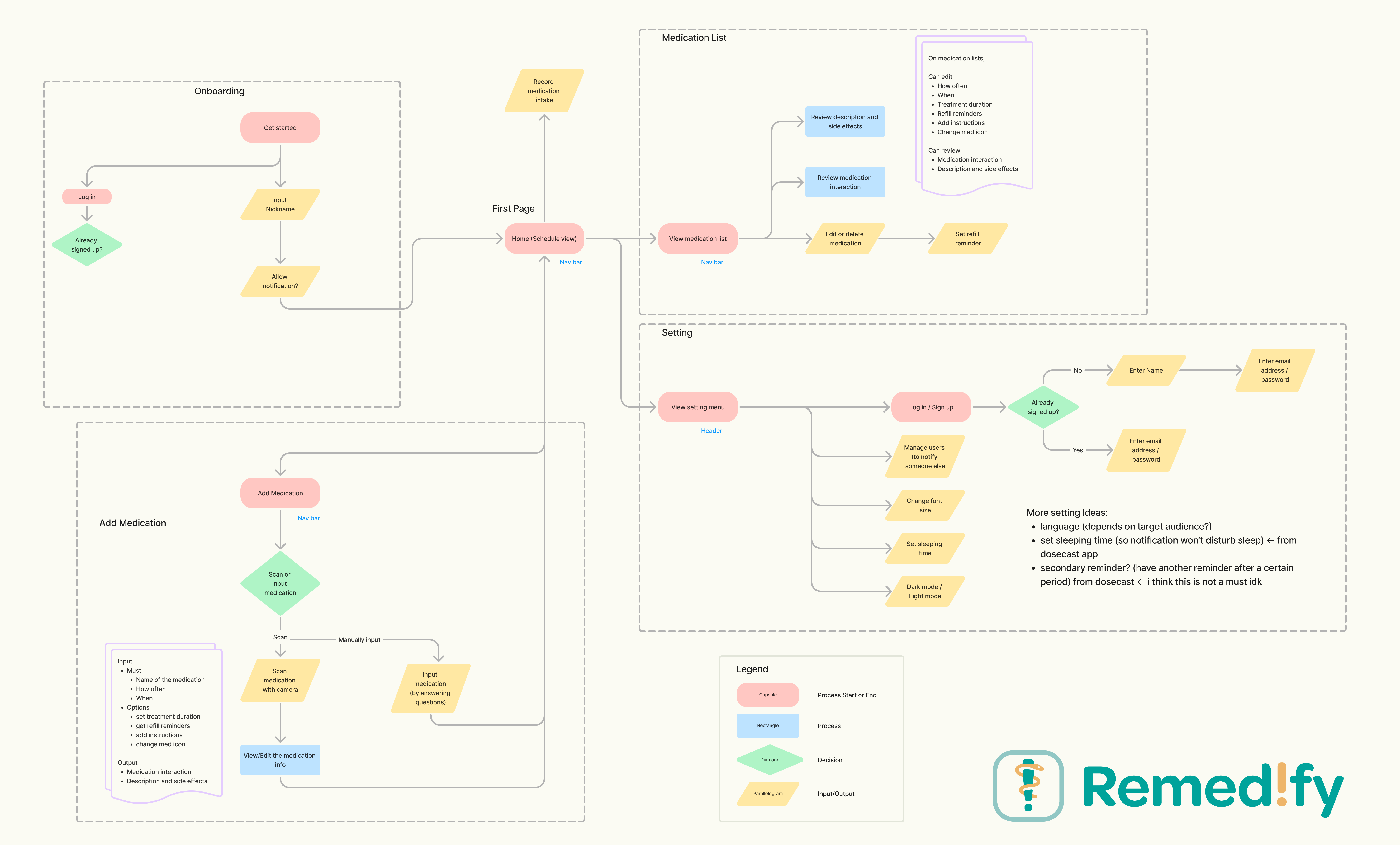
Key User Journeys:
- Logging Medication Intake:
- Home screen → Confirm intake with one tap
- Adding a New Medication:
- Home screen → Tap “Add Medication” → Scan medication label or input manually → Set reminders → Save and view in the Medication Library
- Viewing and Managing Medications:
- Home screen → Navigate to “Medication Library” → View or edit details → Save changes and return to Library
- Adjusting Settings:
- Home screen → Tap “Settings” → Adjust preferences, e.g.font size, language → Save changes and return to Home screen
Wireframing
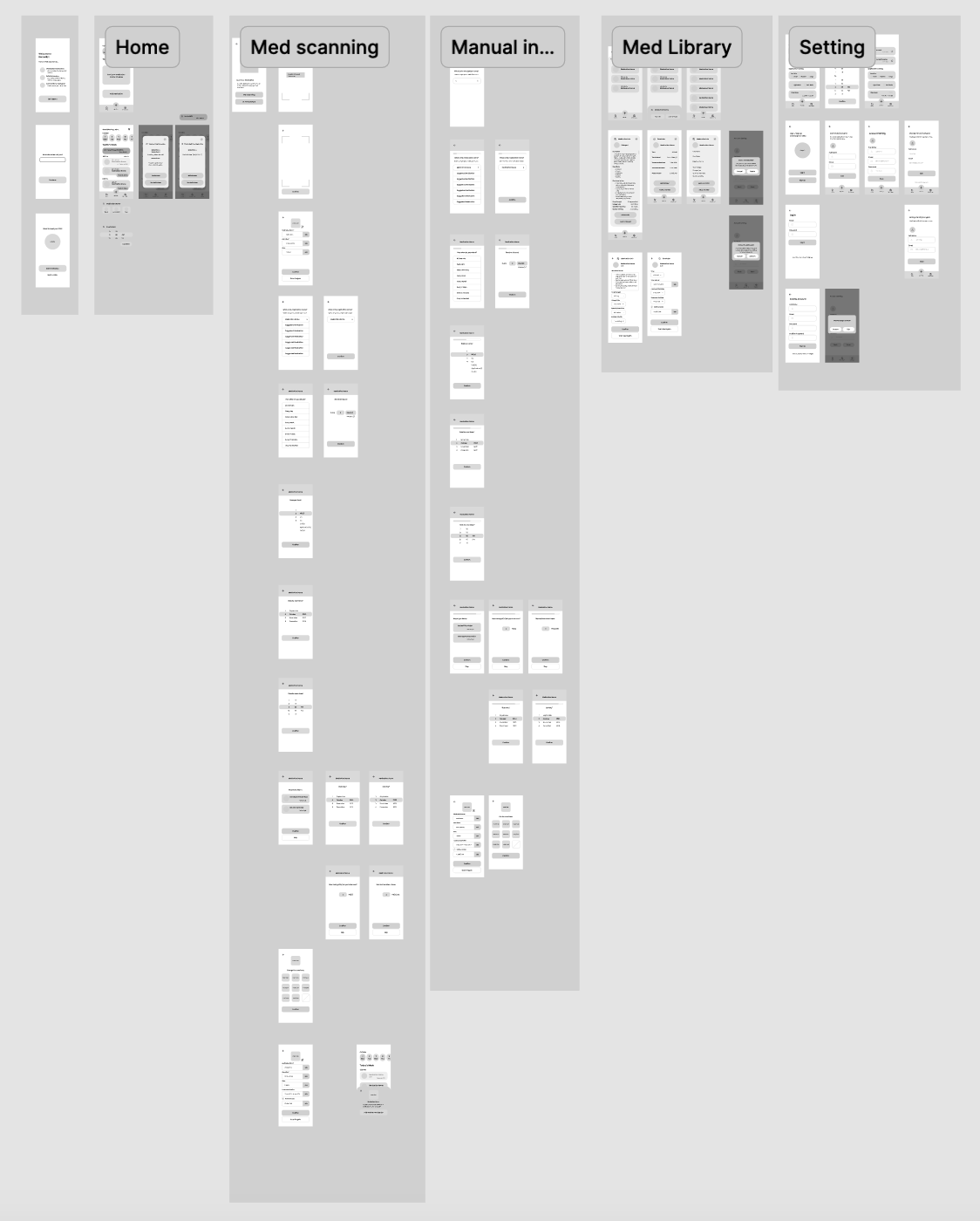
Guided by the site map and user flow chart, the wireframe was developed to visualize the app's layout and user interactions. Drawing on insights from the competitive analysis, the focus was placed on crafting a user-friendly experience tailored to the needs of the target audience. The wireframe showcases how users will engage with each feature, ensuring intuitive navigation and ease of use.
Initial Hi-Fi
The hi-fi prototype aligns with the site map and user flow, incorporating colors from the style guide to create a design that is inviting, professional, and user-friendly.
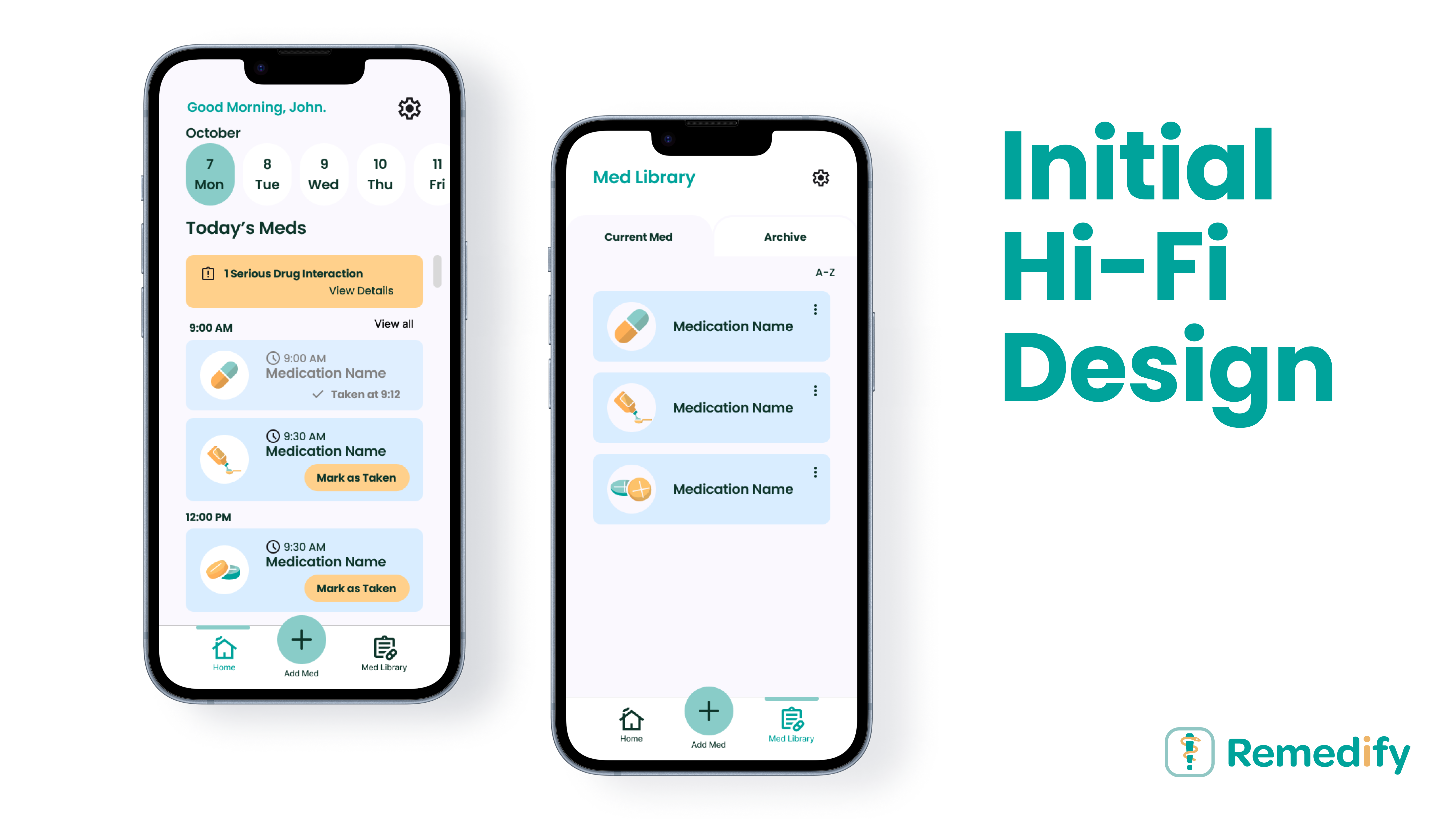
Design Highlights:
- Icons and Graphics:
- Intuitive visuals guide users and reduce cognitive load, making navigation simple and engaging.
- Error Handling:
- Clear error messages help users resolve issues, like failed scans or incomplete reminders, with ease.
- Quick Dose Logging:
- A "Mark Taken" button on each medication card allows one-tap tracking, ensuring a seamless experience for all users.
Usability Testing
Usability testing was conducted with 4 participants, which involved observing users as they interacted with Remedify. Insights are then drawn to improve the interface and functionality of the app.
Upcoming medication logging
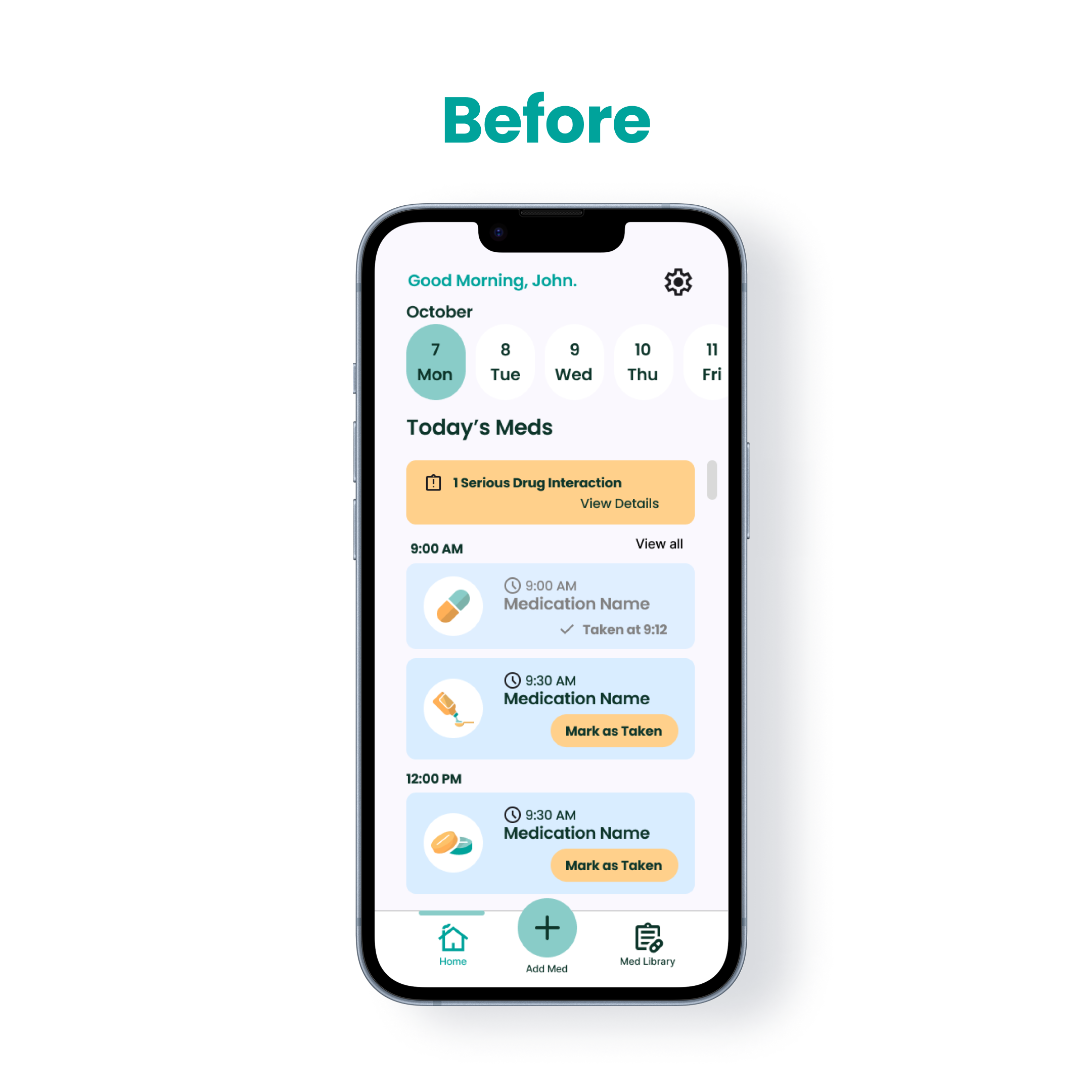
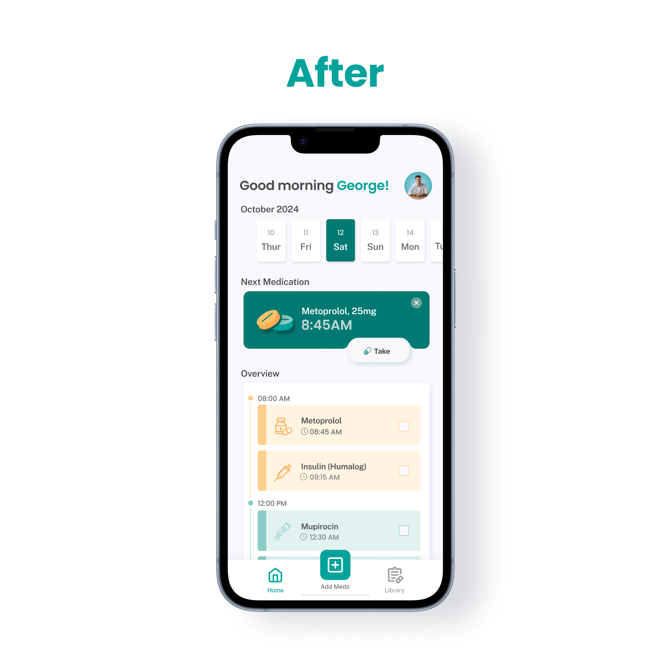
- Participants highlighted the need for a simplified way to log daily medications.
Before:
- Introduce a prominent “Mark as Taken” button as the primary call-to-action (CTA) on the homepage. This feature streamlines daily interactions, enabling users to log medications quickly and efficiently.
After:
Medication Library
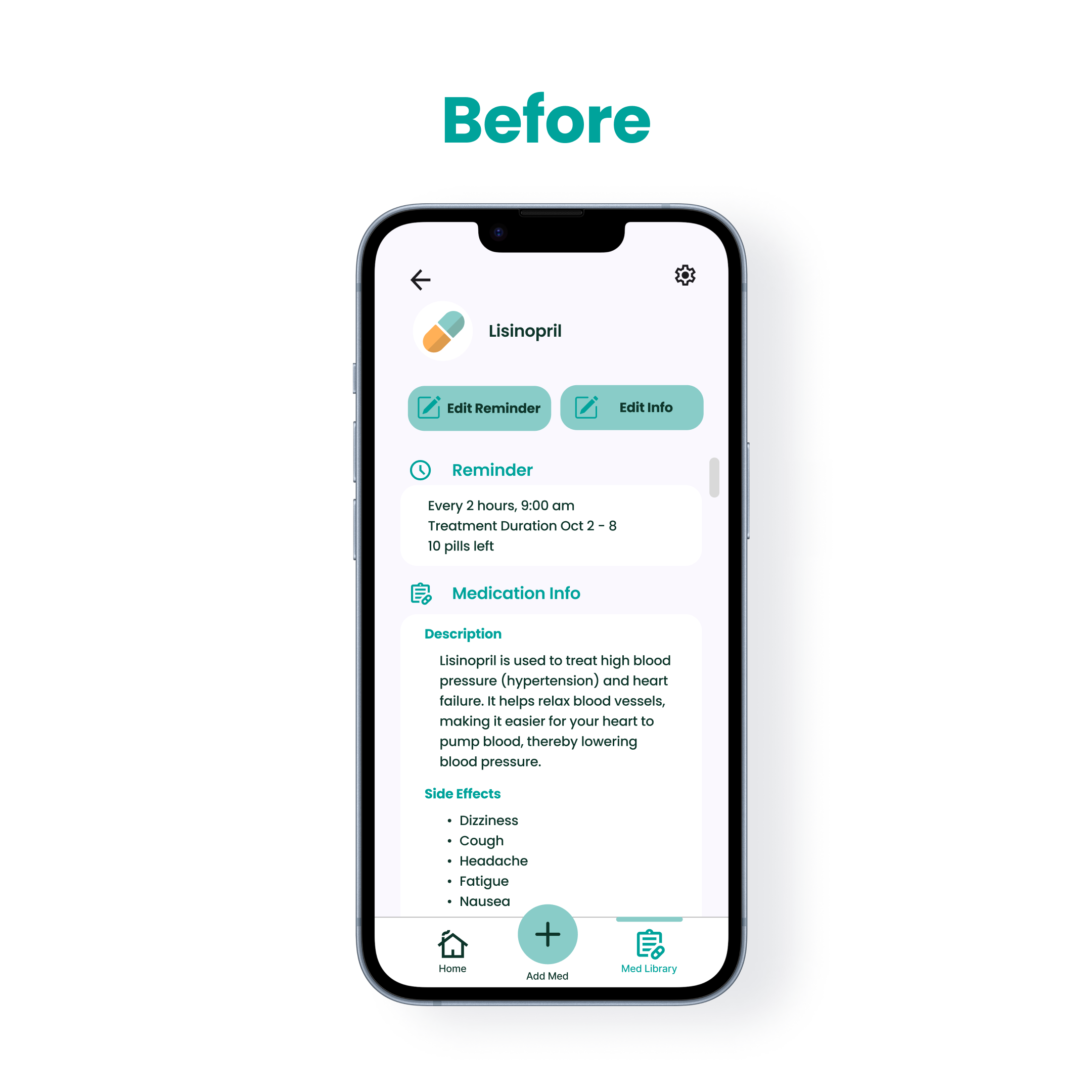
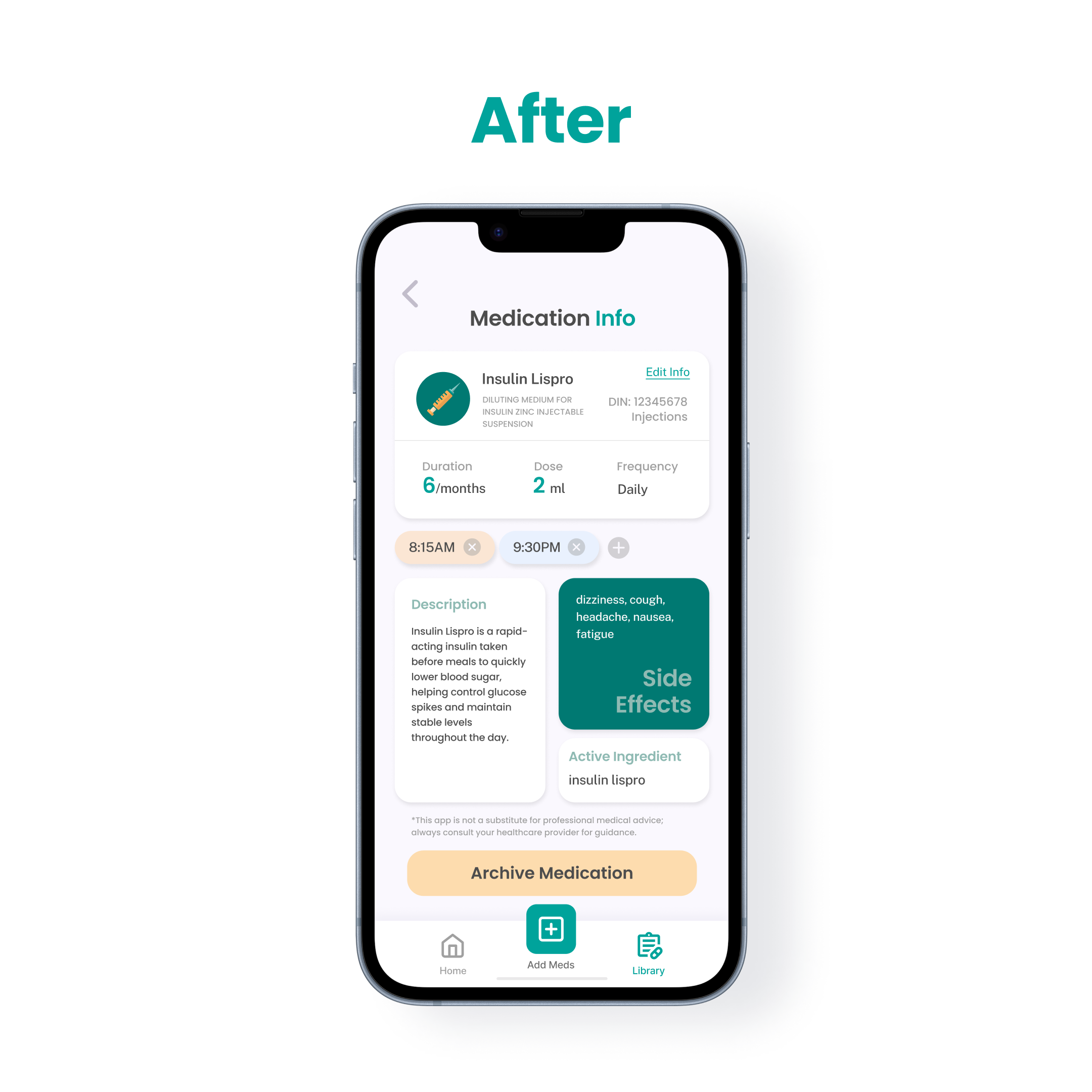
- Feedback indicated that the medication list was overwhelming and difficult to navigate.
Before:
- Display medications as visually organized cards, presenting key details clearly. This update enhances navigation and keeps users informed without creating unnecessary complexity.
After:
Color Palette
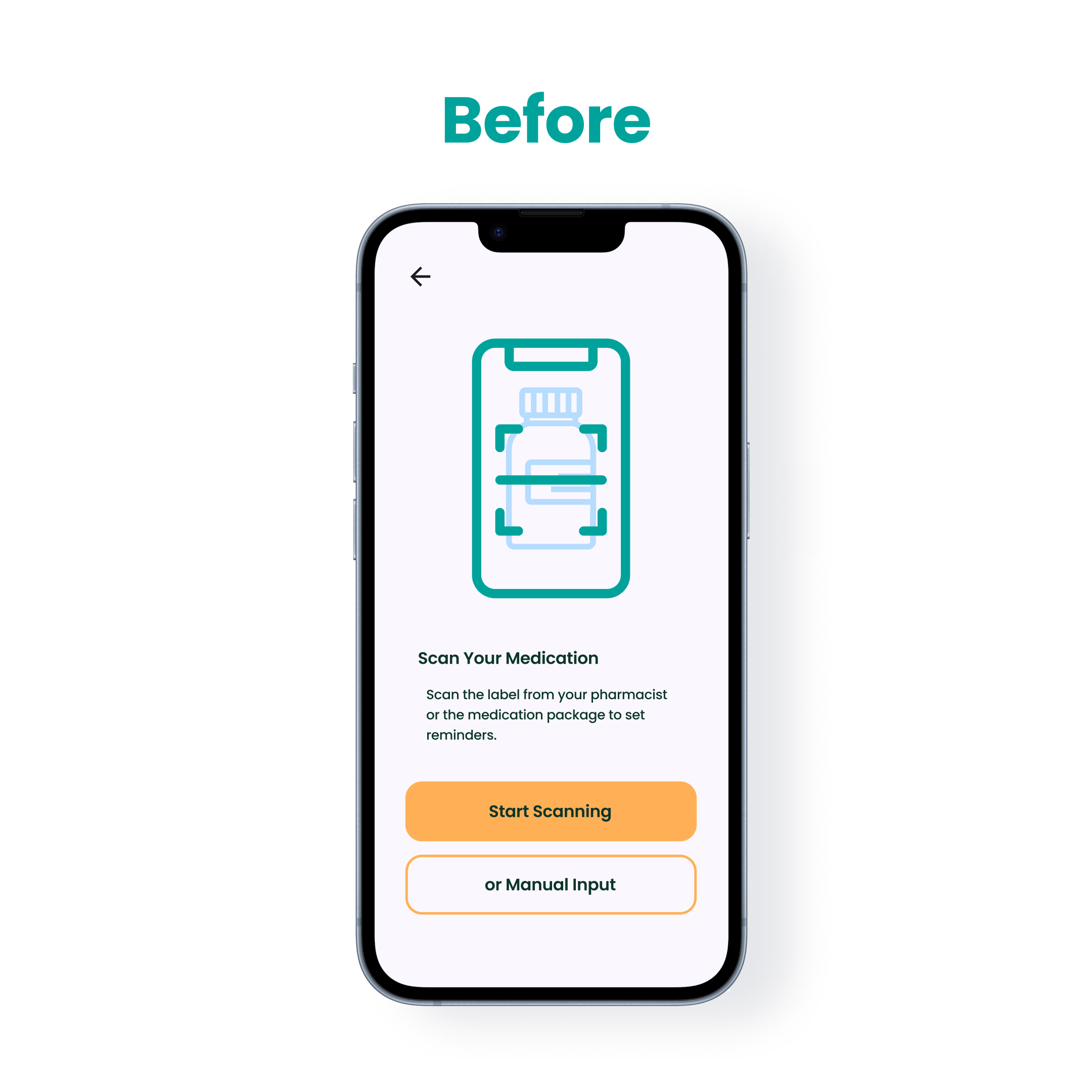
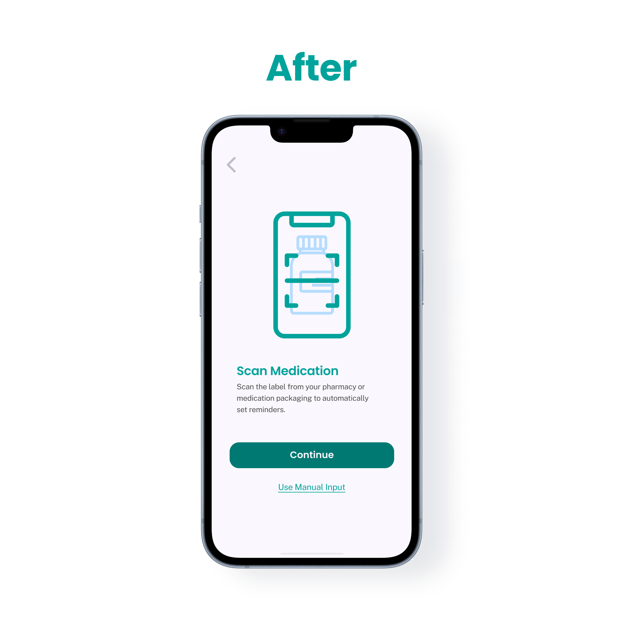
- The heavy use of orange in the design was perceived as harsh and warning-like, detracting from the app's supportive tone.
Before:
- Replace orange with green tones to create a calmer and more supportive aesthetic, aligning with the app's mission of promoting comfort and trust.
After:
“Take Photo” Button
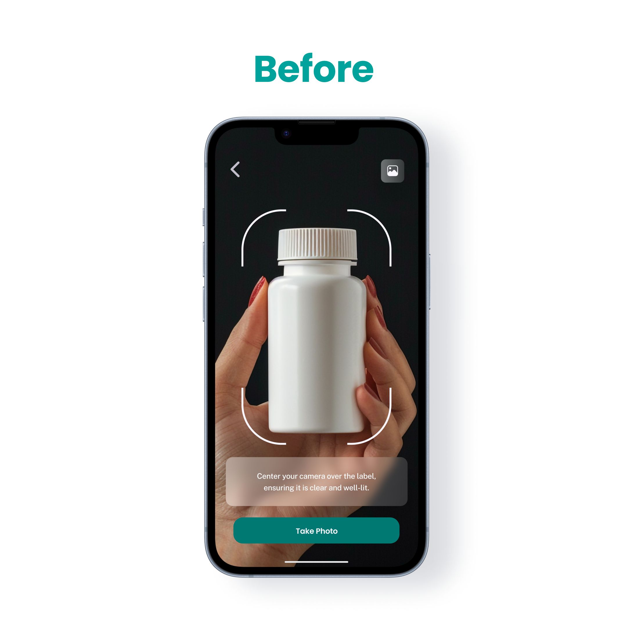
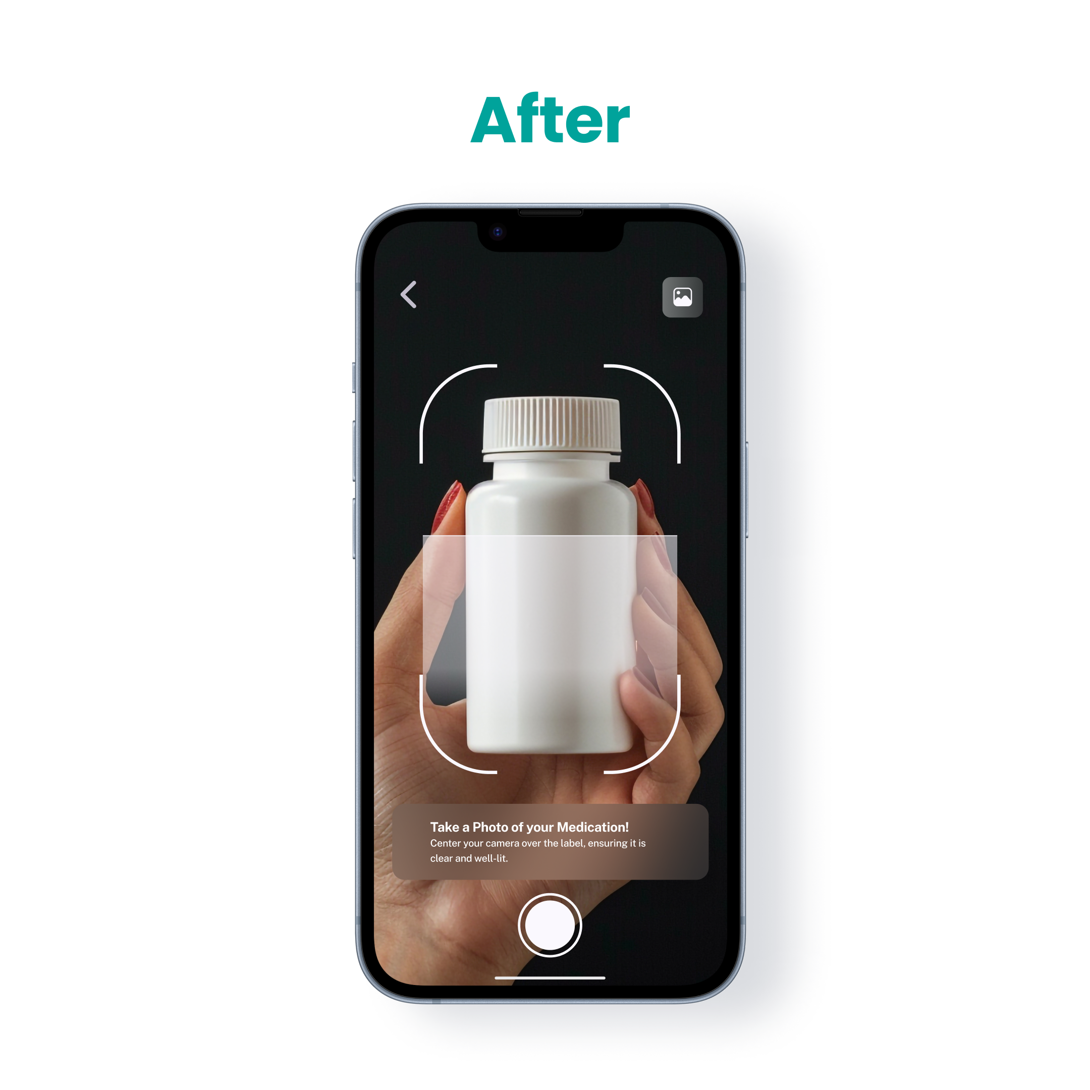
- Participants mistook the “Take Photo” button for a static instruction rather than an actionable element.
Before:
- Redesign the button to resemble a camera button, similar to those on smartphones, ensuring it is recognizable as interactive.
After:
Final Hi-Fi
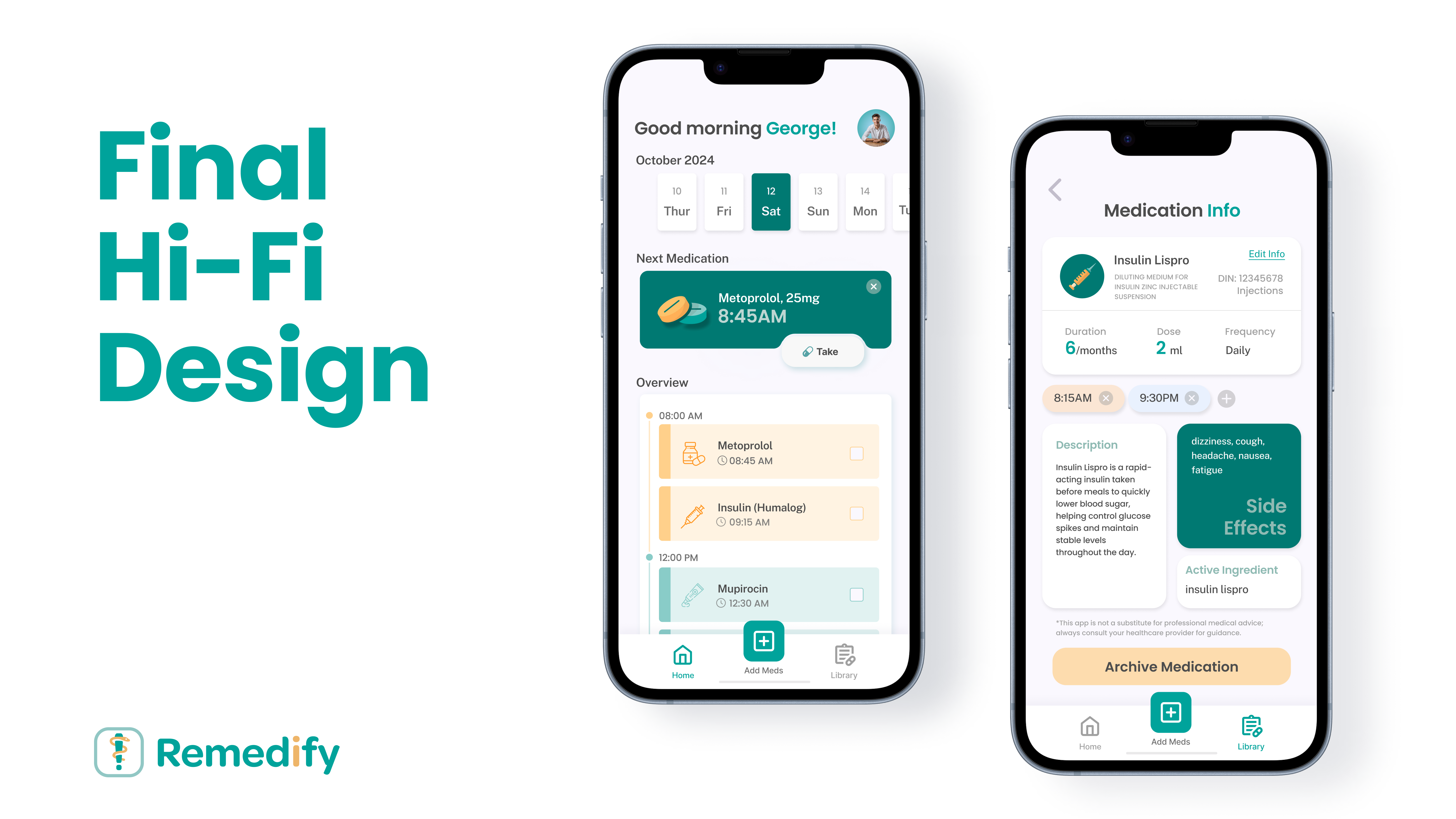
After several design iterations and incorporating feedback from usability testing, the final design of Remedify is crafted to create an intuitive experience that fits user needs.
Marketing Landing Page
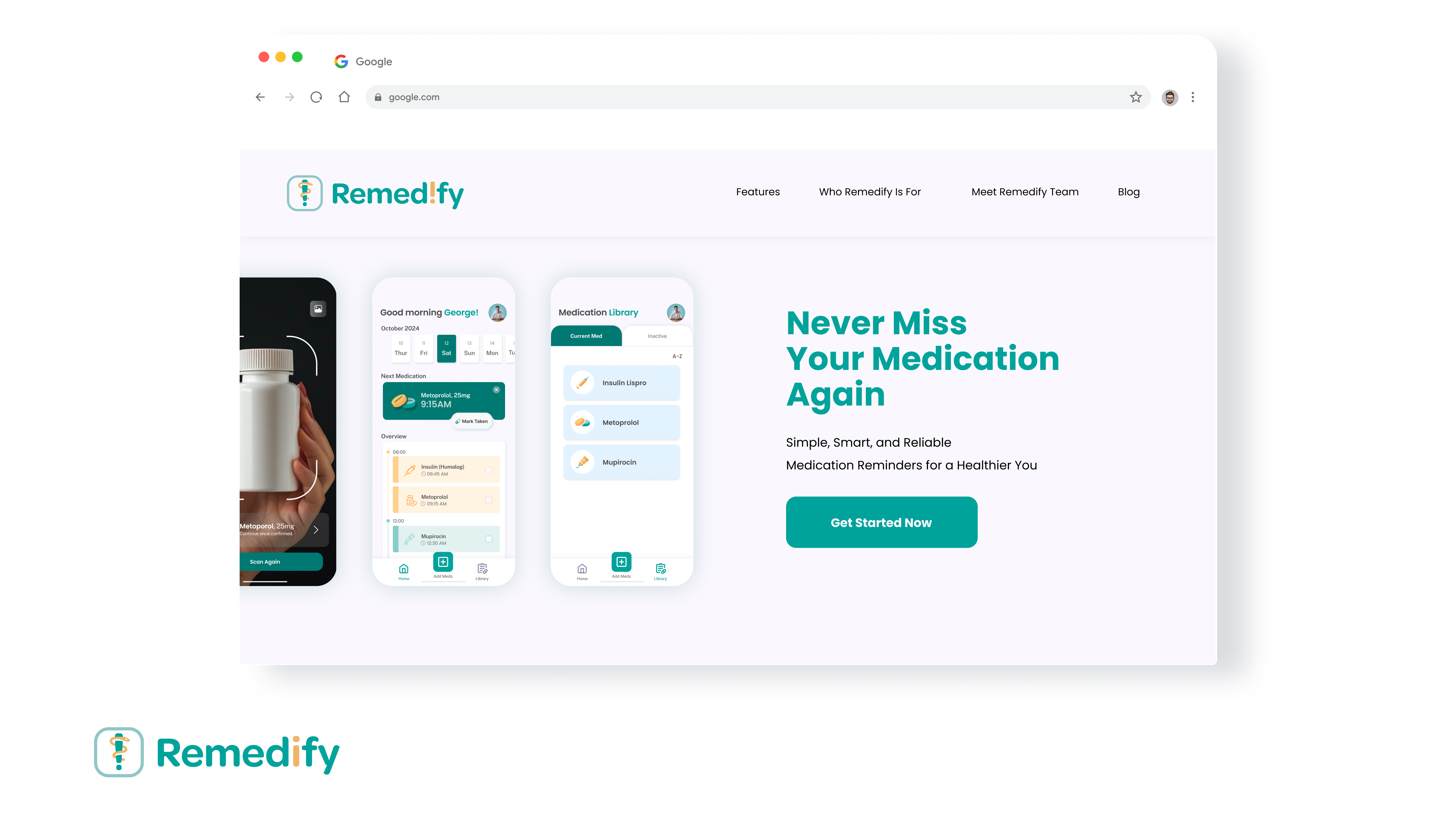
The marketing landing page for Remedify serves as the main introduction to the app, designed to inform and engage potential users. It is crafted to highlight the app’s unique features, target audience, and the team behind its development.
Reflection and Learnings
- Integrating AI into App Design:
- Building Remedify taught me how to use AI-driven features, like image recognition for medication identification, while ensuring a smooth and user-friendly experience.
- I learned to balance automation with user control, making AI auto-fill helpful but still allowing manual inputs.
- Effective Team Leadership:
- Leading the design team strengthened my skills in guiding creative direction, managing workflows, and providing feedback.
- I learned to balance different perspectives, resolve challenges, and keep the team motivated while meeting project deadlines.
- Collaboration with Developers:
- Working closely with developers helped me understand the importance of aligning design with functionality.
- I improved my ability to communicate design ideas clearly, adapt to technical constraints, and refine UI elements for better usability and performance.
Next Project is...
